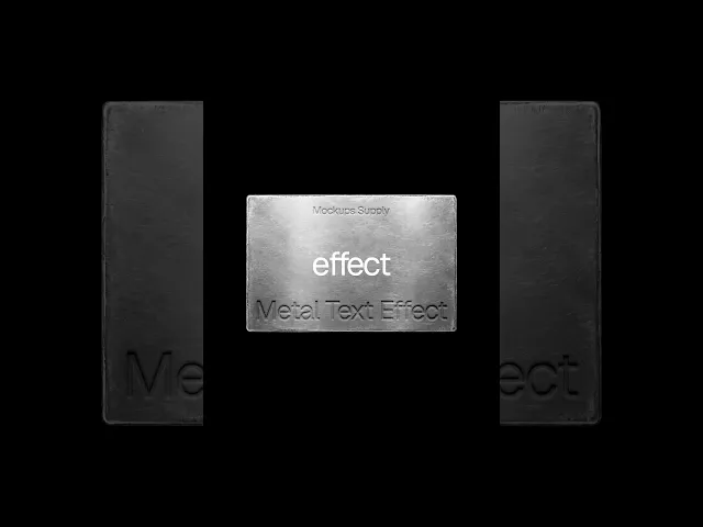
How to Create a Metal Text Effect in Photoshop
Reading time
4
Written by
Mockups Supply
Published date
Oct 5, 2026
Category
Tutorials

Creating a realistic metal effect in Photoshop does not require a complicated setup. With a metal texture and a few Layer Style settings, you can make text, logos, symbols, or other graphics look pressed directly into a metallic surface.
In this tutorial, we will recreate the debossed metal effect using Bevel & Emboss, Inner Shadow, and Drop Shadow. The same technique can be adapted for logo presentations, typography, branding graphics, packaging concepts, and other Photoshop projects.
Want to recreate the same look? You can get the metal textures used in this tutorial from our Text Effects collection.
Watch the full process in under a minute, or follow the detailed steps below.
What You Need
For this effect, you only need:
Adobe Photoshop
A metal texture
Your text, logo, or graphic
The texture has a large influence on the final result. Brushed metal, steel, aluminium, scratched metal, and darker industrial surfaces can all produce slightly different results.
You can use the same technique with typography or replace the text with a logo or symbol.
Need the texture first? Get the metal textures here.
Step One: Add the Metal Texture and Your Artwork
Open your metal texture in Photoshop and place the text, logo, or design you want to deboss on a new layer above it.

Position the artwork where you want it, then set the layer Fill to 0%.
Your design will disappear, but the layer itself is still there. This is exactly what we need because Photoshop can continue displaying the Layer Styles while keeping the original artwork transparent.
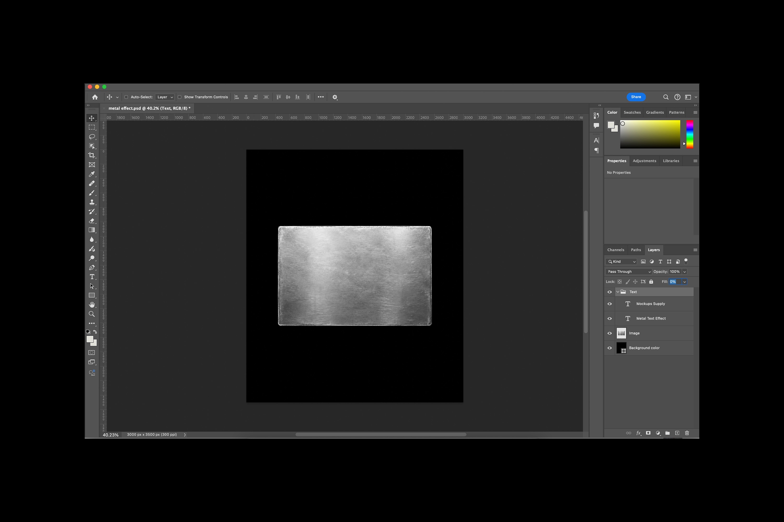
Why set Fill to 0%?
Fill and Opacity behave differently when Layer Styles are involved.
Reducing Opacity fades both the artwork and the effects applied to it. Setting Fill to 0% hides the artwork itself while keeping effects such as Bevel & Emboss, Inner Shadow, and Drop Shadow visible.
That allows the metal underneath to remain visible and gives us the base for the recessed effect.
Step Two: Build the Debossed Effect
Double click the artwork layer to open the Layer Style window.
For this effect, we are using three styles:
Bevel & Emboss
Inner Shadow
Drop Shadow
You do not need a complicated stack of effects. These three are enough to create the depth, edge definition, and subtle shading that makes the artwork look pressed into the metal.
Bevel & Emboss
Start with Bevel & Emboss.
This creates most of the depth around the edges of the artwork and establishes whether the design feels raised or recessed.
These are the exact values we used:
Style: Emboss
Technique: Smooth
Depth: 150%
Direction: Down
Size: 20 px
Soften: 10 px
Angle: 90°
Altitude: 30°
Highlight Mode: Linear Dodge (Add)
Highlight Opacity: 10%
Shadow Mode: Linear Burn
Shadow Opacity: 20%

The values do not need to match perfectly. The right depth and size will depend on your artwork and the resolution of your Photoshop file.
Inner Shadow
Next, turn on Inner Shadow.
The inner shadow darkens part of the recessed area and makes the artwork feel more physically pressed into the metal rather than simply outlined.
Our Inner Shadow settings:
Blend Mode: Linear Burn
Opacity: 35%
Angle: 90°
Distance: 10 px
Choke: 0%
Size: 8 px
Noise: 0%

Drop Shadow
Finish the effect with Drop Shadow.
Keep this relatively subtle. We are not trying to make the artwork float above the surface. The shadow is there to help define the edges and support the sense of depth created by the other Layer Styles.
Our Drop Shadow settings:
Blend Mode: Linear Dodge (Add)
Opacity: 20%
Angle: 90°
Distance: 8 px
Spread: 0%
Size: 8 px
Noise: 0%

Step Three. Adjust the Effect to Your Design
The settings above are the exact values we used for this example, but treat them as a starting point.
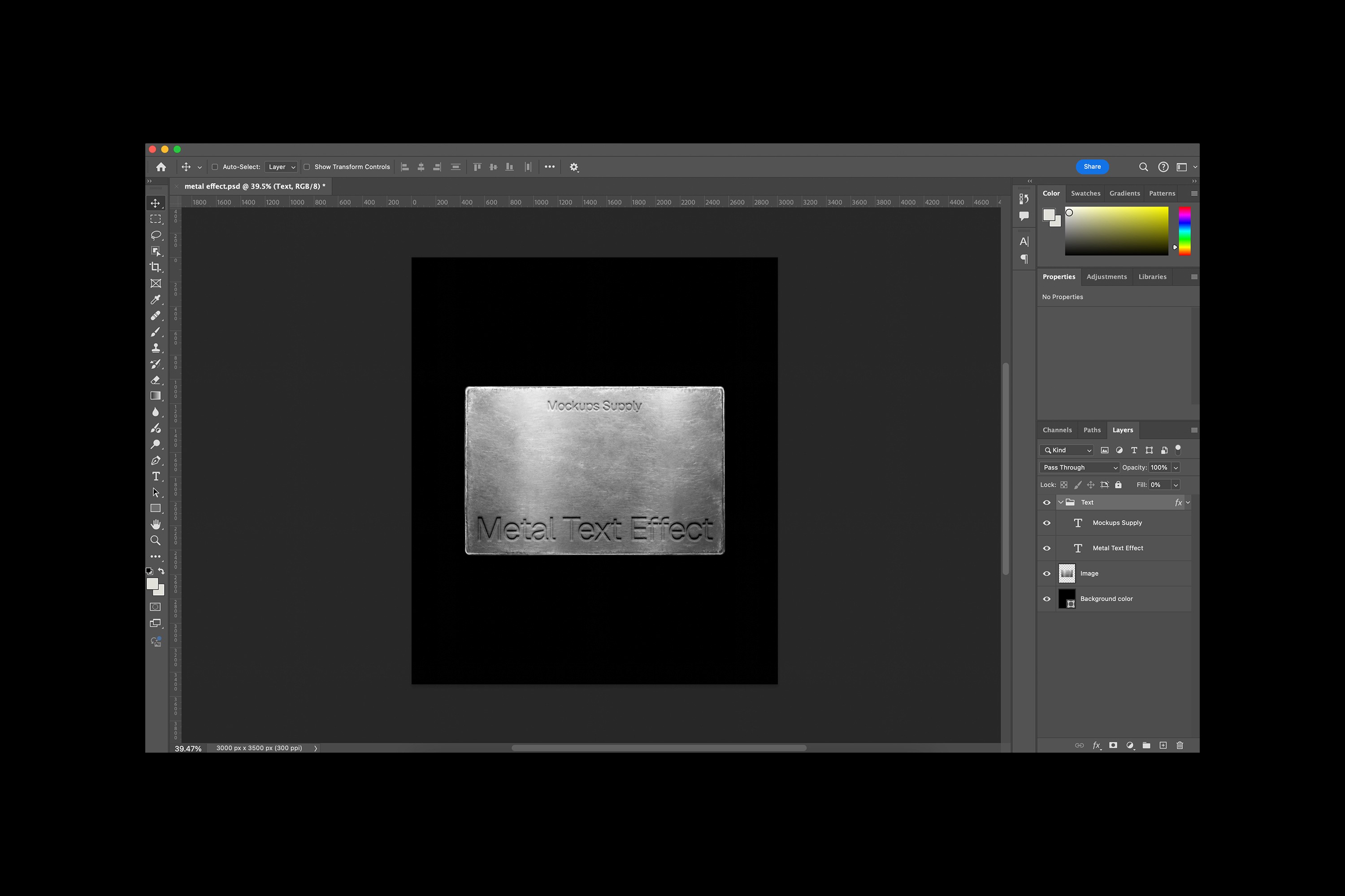
A small logo, large wordmark, thin typeface, and heavy display font will all react differently to the same Layer Styles.
If the deboss feels too deep, reduce the Bevel & Emboss depth or size.
If it looks too flat, gradually increase the edge contrast or Inner Shadow.
The goal is to make the design feel like part of the metal rather than an effect placed on top of it.
Try It With Logos Too
This technique is not limited to typography.
You can replace the text with a logo, monogram, icon, symbol, or other graphic and use the same setup to create a debossed logo effect in Photoshop.
It works especially well for branding presentations where you want to show how an identity might look on metal signage, packaging, product surfaces, stationery, or other physical applications.
Looking for more effects to use in your branding work? Explore our Text Effects collection.
Debossed vs Embossed Text
Debossed and embossed effects are similar, but they create opposite impressions.
A debossed effect makes text or artwork appear pressed into the material.
An embossed effect makes the artwork appear raised above the surface.
Both can be created with Photoshop Layer Styles such as Bevel & Emboss and shadows, but the direction and balance of the highlights determine how the depth is perceived.
For this tutorial, we are creating the recessed version.
Ready to use it?
Get the metal textures and effects from this tutorial, add your own typography or logo, and see the final design in context with Mockups Supply.

